


Typography
“Typography is a CRITICAL part of how we tell stories.”
As an aspiring Public Relations practitioner, soaking up any amount of information is crucial throughout college. Most of time I nod my head and scribble into my notebook, not fully grasping the concept of what I’m learning. When learning about typography, I thought to myself, “Yeah ok it’s nice when letters look nice and stuff, I get that.” But I didn’t really “get that” until I played several font games. Honestly, I never thought I would actually understand a PR concept through an online game… but I have and I’m here today to share the knowledge I gained.
- Shoot The Serif
Here’s a screenshot of me, attempting to beat the level I struggled with the most. The levels before this were pretty simple in that there weren’t 48 serif and sans-serifs to choose from. I would get so into this game I actually felt like a cop finding the “bad guy” aka the serif. I finally got it narrowed down to “good citizens” or sans-serifs, that were direct, clean and plain (nothing to hide) and serifs that were curvy, angled and consisted of varying thick and thin lines (sneaky robbers of some sort, I assumed). After about 30 minutes of playing Shoot the Serif, I decided that my true potential in life is to become a detective on dissevering between serif and sands-serif.
2. Poster Letters
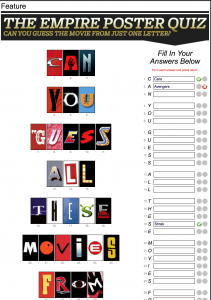
Okay, before I pull up the picture this time (because you will laugh at me for how terrible I am at this game), let me just say two things: I really do watch movies and although this game made me feel like a failure, at least I learned something from it. That being said, what did I actually learn? When I looked at this screen initially, I thought it was going to be a breeze (and then I missed the second question, and didn’t know the third and so on…). Anyways, through the content videos on D2L, I remember one of them connecting typography to emotion. “Yeah right,” I thought. I then began to closely look at the letters, as you can see the two I actually got right are Cars and Shrek. Both lighthearted, silly and happy ending movies. Immediately when I guessed those movies based on ONE letter in their title, I kind of did that thing where you tilt your head and crack a half smile because you remember how the movie made you feel. I got that emotion from a font. I learned quickly that it is so important for the very font you chose to match your message because you have the ability to make an impact on your audience. I can honestly say I haven’t seen the movie Cars or Shrek in years, but the message remained and emotions flooded back when I saw a specific font. Shouldn’t we want all of our messages to have that effect on our audiences?
3. Type War

I DID IT! I MADE IT TO THE END OF LEVEL 10!!
This game and I have a love, hate relationship. Honestly, I’ve never been so determined for extra credit in my life, but I actually felt determined and I actually felt like I had to gain the knowledge in knowing the difference between the fonts. Going into the game, I was excited to see my friend Times New Roman because we’ve gotten really close over the past two years in college. In order for me to keep up with this game, I had to characterize the fonts. For example, Garmond became “the girly one”, Veranda became “the boring/ basic one” and Futura became the “manly/outer-space like one”. It seems silly, but that’s what allowed me to get through all 10 levels of this game. Each typography has its own characteristics, along with each family member, or font. I learned that different fonts are used in different settings, and it is important to be able to tell the difference so you have a more clear understanding of what you want to use depending on your target audience and your message.
I hope you enjoyed my typography gaming experience as much as I did! As much fun as I had, I learned valuable information regarding the effect of typography and will always remember that “typography is a CRITICAL part of how we tell stories.”
-Courtney

Comments