

TYPOGRAPHY
For our latest assignment we were to play three different games about typography. These games consisted of different font recognition to the alignment of text. Being the competitive person that I am, I played each game three or four times trying to beat what I had done prior. I can say that I was good at somethings and, to put it lightly, tragic at others.
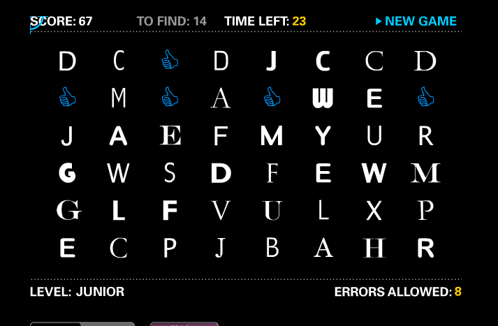
The first game I played, which I believe was the most fun was Shoot the Serif. This game consisted of finding the letters in the group that were serif compared to san-serif. To add to the drama and excitement, each round consisted of more and more letters, and not to mentioned the whole thing was timed. I think the time aspect almost made me do worse because i was blowing through the rows and then having to go back after missing the tricky ones.
The next game I played was Type War. Now, this game kinda got me mad because I wasn’t very good at it….The first time I played, I just blew through and didn’t really thinking about the answer I was choosing. After taking a second try, I really looked at what the letters looked like and my choices at hand. Reaching back in my not so photo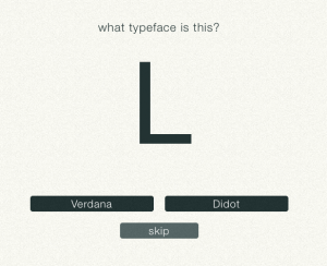 graphic memory from letters in the past I was able to make an educated guess as they would say on to which font was in front of me. Wanna play? Do you know what font that L would be in the picture?
The last game was


Comments