

Typography
Typography is one of the most powerful tool of design. The way your eye catches a written message says everything about the typography of that design. The following are discussions over my experience playing several typography games. Over all I learned to be more observant of this element that is used is such a great way by graphic designers.
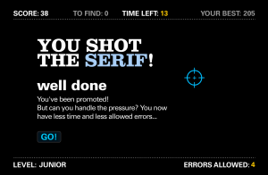
Learning about SerifBefore this class I had never taken notice of the difference serif fonts can make in a design. I took them as one more type of typography. This game is called “Shoot the Serif.” This title is significant as well because it personifies to an extent the idea that serif fonts should be avoided in design. Without them the design looks more modern, minimalistic and easy to read. From the score on the screen shot provided, you can see that I am still not the expert I would like to be when it comes to differentiating between the two. However, this game was a good exercise for the brain, and now I will be more conscience when observing other designs and my own.
KernType
Kerning refers to the act o f distributing space between text so it is pleasant and easy to read. For this game I had the mission of distributing space across the letters from a given word. The best part was that my work was being compared to typography experts. I am the type of person who thinks, “balance,” when I hear of design. I used this thought process to distribute space with letters. I learned that no matter the font type or size, the goal is to always have as close equal distance as possible from each letter across the word.
The screen shot above is from one of my closest attempts of balancing the space within the word in the game.
Type Connection
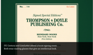
This game was very entertaining for me because I was given a simple task of being a matchmaker. Type Connection is a fun way of learning about the different font pairings and what occasions they are best suited. A winery menu for example can to seem classy, elegant and romantic. The fonts from the screen shot are a match because they are both similar in character. They both have an intellectual look that sets them apart from the rest. I learned to read the message I was portraying through the fonts I was using.

Comments