

Typography
Over the past few years, I have repeatedly learned that how something is displayed will determine the type of message it gives to others. However, I didn’t realize how much effect the type of font can have in creating an attitude for a publication. Typography is not something we are usually taught in our classes, but I think it is very important for anyone who will work in a creative field of work. In my PR Publications class this semester, we were asked to play a few games to help sharpen our typography skills. I thought they would be a breeze, but they were actually harder than I originally thought. Below are my thoughts that I had while playing this fun learning games.
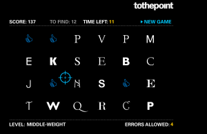
In this fun game, the player has to “shoot” the letters that are in serif fonts, being careful not to accidentally click on a sans serif letter. I found this game to be extremely fun for a learning game! Over the years, I have learned about the differences between these two types of fonts, but when there are 24 grouped together, it’s surprising to see how difficult it can be to identify which is serif. This game definitely helped me to sharpen my skills for detecting which fonts are considered serif or not, and I may even continue to play this game every once in a while to help improve my design skills.
 Type War
 is a game that will show you just how little you actually know about fonts. Anytime I create something in Microsoft Word, I endlessly click through the list of fonts to figure out which one looks best in my design. But after this game, I now have a little more knowledge on what the fonts actually look like, which will hopefully help to speed up my creative process. There are 10 levels of this game that get harder and harder as you continue to select the correct font, giving you plenty of practice for determining which font is which. I am actually glad I played this game because I feel like I have learned a lot from it that I can apply when I create my next design project!
Kern Type

This game is all about determining the correct amount of space in between the letters of a word. I went into the game thinking it would be easy, but boy was I was wrong. It was actually pretty hard to figure out how far apart the letters should be! Each time I thought I had them perfectly spaced, I would only click “Next” to discover I had gotten a score of 60/100. What was I doing wrong? Thankfully, the game shows you how the letters should be spaced, and I eventually started to improve my score. Before this game I had thought spacing was common sense, but now I know that it takes time and patience to really figure out how far apart letters should be from each other.


Comments