

Typography
PR Pubs has officially started, and I am learning that I do not know a lot about design. While looking through our powerpoint this week, it went over spacing, fonts, alignment and many other aspects of design that designers put into their ads, brochures and other creative works. All of this information was foreign to me.
Then I went on to play a few of the typography games. I started with “Shoot the Serif” which was a game where you shoot the font that you believe to be serif and each round gets harder, adding more fonts to the mix. I was absolutely terrible. I had no concept of what serif font was when it got to the fourth or fifth round because there were so many other font options.
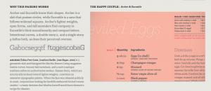
Next I played “Type Connection” which happened to be my favorite. You picked a font as a main character and then had to match other fonts to it that were compatible. I found this game to be very educational because I wanted to keep discovering which fonts work well together.
Lastly, I played “Poster Letters.” This game had the first letter of a movie title in the title’s font and the player has to guess what movie it is. First of all, I should have never chose this game because I am terrible at naming movies. I got three right on the first try.
These typography games made me realize that I have a lot to learn when it comes to fonts. I hadn’t paid to much attention to fonts that work well together and how they take on different personalities. After playing these games, I realized that there is much more to picking a font then simply going through a list.

Comments