

Typography
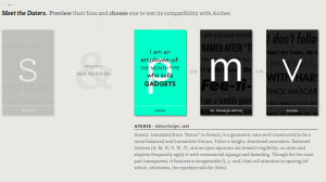
I am such a fan of pretty font and how a font can make or break a design. With that being said, I do not have pretty handwriting and the only font I use to type is Times New Roman. The type connection was such a good indicator in how font matches and what looks good together. I see this game being extra helpful when making a flyer or newsletter. I feel like it allows us to get a feel for good font combinations and make our designs that much better.
Kern Type was my favorite game! Clearly practice makes perfect. It was very cool to see how important the spacing between each letter is and how it can make a difference in the overall look. This game allowed me to really put my attention to detail to test.


First off, I am obsessed with the title of this game (I Shot the Serif)! It was very interesting to see how many different type of Serif fonts there were. It was easier to tell which font were Sans-Serif than the ones that were Serif.


These games allowed me to pay more attention to the font and the difference/similarities. I think paying more attention to the fonts will allow us to use fonts that will enhance our design.


Comments