

Typography
In class this week we discussed some important elements of design. One of them is typography, which is the art and technique of arranging type to make it not only readable by appealing when displayed. I love pretty handwriting and even took a short calligraphy class freshman year, so fonts are really interesting to me. To learn a little bit more about the different fonts that exist I played three different typography games.
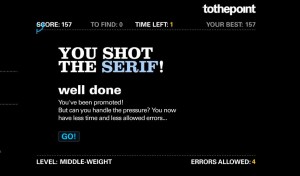
In Shoot the Serif the goal is to distinguish between serif and sans serif fonts. You have to shoot the serif fonts as a timer is going, and if you shoot the sans serif fonts you lose points. I knew the difference between the two before playing, however, it was harder than I expected. Some of the feet were minuscule and others were more of a script font, so it became difficult to tell if they were serif fonts or not. This game was interesting and a little addicting. I liked focusing on the font differences in this way.
In Type War the point is to pick the font name that matches the letter being shown. Since I am guilty of always using Times New Roman, I was not very familiar with the fonts in the game. This made it pretty hard for me. I used Microsoft Word to help distinguish between the two answer choices, so that helped. Type War wasn’t as fun as Shoot the Serif, and it took a long time to get through the rounds. Playing this game did help me learn quite a few new fonts and in the future I may go back and play to learn a few more. It was interesting to see how many fonts are so similar but yet distinguishingly different.

Kern Type was another really fun type game to play. The purpose was to position the letters in the word to be evenly spaced out, which is what kerning is: the space between letters. As you can see, I didn’t do so hot in the beginning, but I eventually I got the eye for getting my letters evenly spaced out. It was neat to see how precisely spaced fonts can make a difference in the appeal of a design.


Comments