

Typography
I played all of the typography games listed, minus one I could not get to work. I have to say I did not know such a thing existed, but they were actually fun to play. I played them for so long I even got my roommate to play them alongside me.
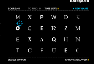
I have heard the term serif font before, but I don’t think I had fully grasped the meaning until playing “Shoot the Serif.” At first I didn’t really know what I was looking for and by the first couple of rounds I was looking for what my roommate described as “the sticky outty part at the edges of the letters.” I found myself wanting to know the advantages of serif and sans-serif font. From everything I’ve read it seems the only difference is serif font is known as more classic, while sans-serif is more modern. It would be interesting to see what effect switching out the two had on an advertisement. 
I definitely spent the least amount of time on Type Connection. It was interesting to see how two different fonts compare to each other. I didn’t realize how much space can vary between different fonts and there is definitely something to consider there when choosing fonts for different things.

Type War was a lot harder than I expected. Although all of the different fonts are usually distinguishable, being able to name them is easier said than done. There were a lot of fonts I’ve never even heard of, which really isn’t surprising considering I usually stick to Times New Roman. It just made me realize how constricted I’ve been in my school work with something as small as font choice. It made me wonder if I was given free font range would I take advantage of it? Can a font help portray a message or get a point across? Of course I doubt this will ever happen, because there would always be that person that insisted on using Comic Sans and ruin it for everyone.

Kern Type just further validated my perfectionist tendencies. I find things on a daily basis that I feel are not centered and it was very satisfying to be able to fix the problem over and over again. Words that were not centered just seemed off balance and distracted me from whatever word it was. Half of the time I did not read what I was fixing until it was fixed.


Comments