

Typography
As a newbie online designer some of these game were actually challenging for me. It is easy to learn facts about design elements but actually having to sit down and decipher the differences between fonts was more difficult than I anticipated. Also who know they have front games for people to play.
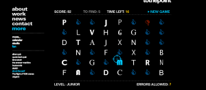
1.Shoot the Serif
Okay first thing I thought of when I saw the title of the game was “I shot the serif but I did not shoot the deputy.” (Yeah I know its really lame, but I thought it was really funny). This was the first game I played and probably my favorite. I could honestly play this game for hours before getting bored (I think I played it for at least 45 minutes without stopping). At times I found it really difficult to find the serifs. I would get down to one left and search the screen frantically looking for that one last bad guy before time ran out. I must admit, once when I was playing the time ran out before I finished the level and I might have yelled at my computer in agony (but don’t tell anyone). This game puts the right amount of adrenaline with the time ticking down to get you really into the game.
2. Kern Type

So this game deals with the spacing in between letters which honestly I had no idea it really makes that much of a difference. But after playing this game, wow spacing is essential in order to make typography look pretty. The game gives you a word and anchors the first and last letter of the word so they cannot move and then the player must space the in between letters correctly. It is actually a lot harder than you think. Sometimes I would be really good at get 100% correct and think to myself “Yes! I’ve finally got the hang of this!” and then the next round get 62% correct. Lets just say this game was an emotionally roller coaster for me. However, I did learn the importance of spacing from this game and how it is key from the aesthetics of a design.
3. Typewar

Typewar was probably the most difficult game assigned to us. It gave the player a letter in a certain kind of font and at the bottom of the screen two different types of fonts were given and the player had to chose which font it was. At first I was thinking to myself “oh yeah I totally got this!” because at the time if was only giving me times new roman versus a different type but as soon as Times New Roman was no longer an option I had no idea what the difference between Optima and Veranda were. I played this game for 5 minutes before getting insanely frustrated. As you can see from the picture I made it to level two before giving up.
I hope you enjoyed reading about my typography experience as I did. Some of these games were actually really fun and I feel like I learned a lot more about typography playing these games instead of reading about different fonts. Remember “Type is the star of the show”
-Jenna Tatman


Comments