

Typography
Let me begin this post with a disclaimer: I am an EXTREMELY competitive person. Any time I play a game, I play to win! And so, as part of this semester’s journey into Public Relations Publications, it was time to examine some type and fonts. What better way to learn than to play! With that said, let’s play!
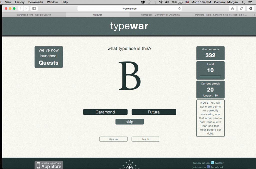
The first game I played was “typewar” (the incentive of bonus points had quite the effect on me). I did achieve level 10, but it was actually difficult to cheat! My Macbook’s version of Pages didn’t have several of the fonts used in the game installed such as Garamond. Nevertheless, I persevered as all champions do.
I actually learned a lot from the “typewar” game. It was really neat to just look at the shapes of letters outside of the context of words and see how many different styles of script there are.
The second game I played was “Type Connection.” I played for a little bit, but the part I found most interesting on this game was seeing all of the matches laid out as I screenshot in the picture below.

I loved seeing how the fonts matched perfectly with the information that the designers chose to illustrate the fonts with. For example, the ITC Stone Sans & PMN Caecilia example that they chose – An entry form – so perfectly matched that I was shocked! It seems that all forms like the one I screenshot all use this same font and combinations of it.
I tried to play the “Poster Letters” game, but I failed miserably! I enlisted the help of some of my friends and they didn’t do much better than I did, so I felt a little bit better about myself.

For the movies that I did know, I was surprised that I could tell the entire title just based on one letter. I have played a similar game on the iPhone that Uses the same concept except it is about brand names. It showed just a small portion of a brand logo and you were supposed to guess the name. As I was more conscious of some of the brands than these movies, I did a lot better. It really speaks to the power of recognizable font and text!
I enjoyed playing these games and they really gave me an eye for discerning font types and implications!


Comments