

Typography Games
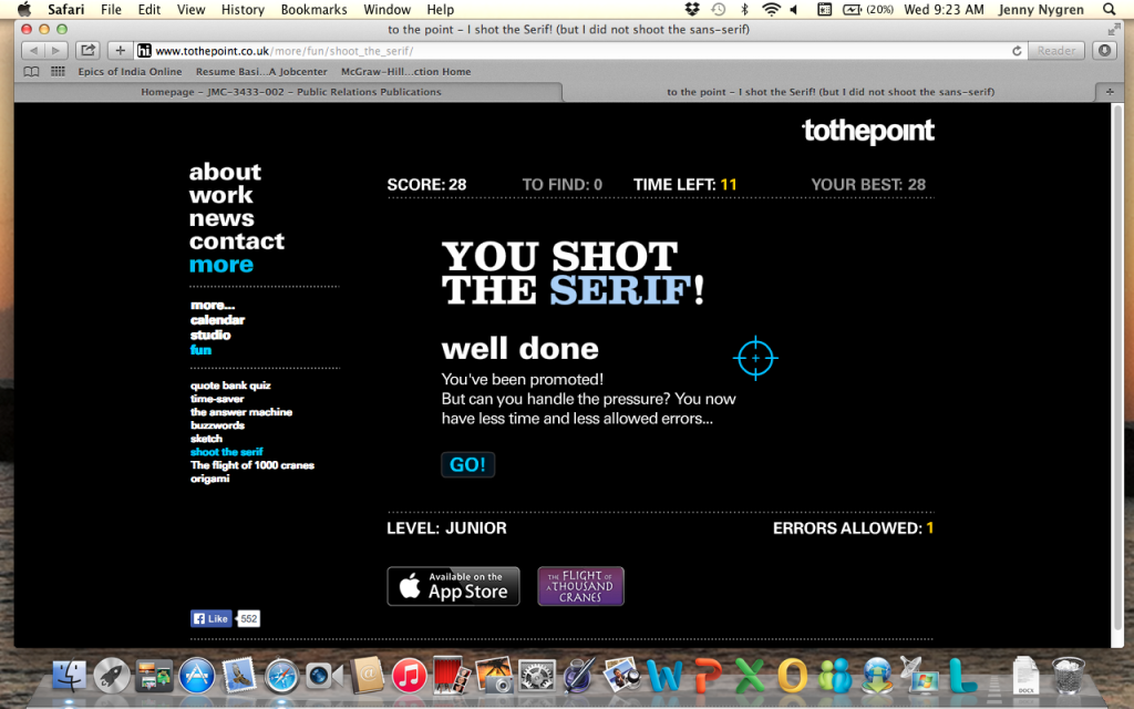
I shot the serif, but I also did shoot quite a lot of the deputies (sans-serif fonts). In this game the two different font types are mixed in together and the user plays a first-person shooter style game to identify the serif fonts from the sans-serif fonts. Practice makes perfect with this game, but it’s frustrating as the stakes get higher. You never really know how much mess ups or time you have left because you’re too busy focusing on the font type!
The next and most frustrating typography game I played was “Type Connection.” It married different types of font that go together in design. My own personal opinions on what would match better with the imaginary personality of the font would get in the way of matching effective design fonts. WHO WANTS TO MARRY SOMEONE WHO IS EXACTLY THE SAME AS YOU. DON’T OPPOSITES ATTRACT? Apparently, this is not how it works in the font’s love lives. I never successfully matched fonts on the first try, it always took two or three times. 
Since I’m a self proclaimed movie fanatic, I expected to do way better than I actually did at this game. Honestly, I barely even tried at some of them. I had absolutely no idea on what movie most of these letters were from, but I did correctly guess “Shaun of the Dead”, so I got one movie that wasn’t from animation.


Comments