IMG_2744-1024x768.jpg

Newspaper Markup

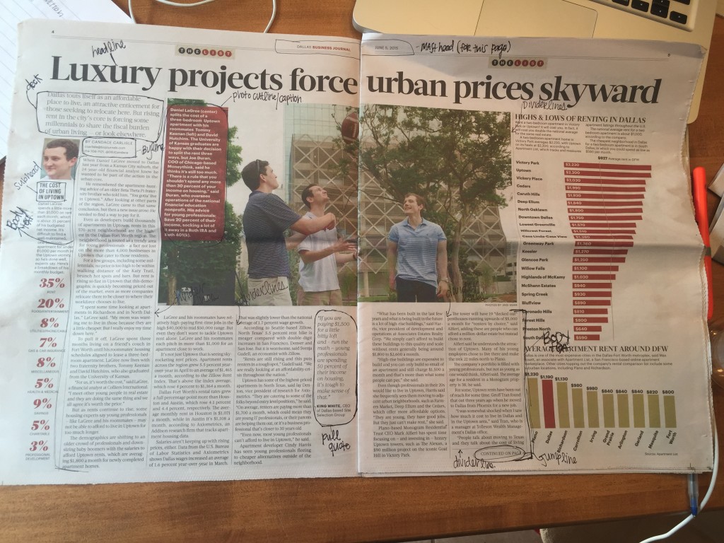
  This mini assignment was easier than I originally thought. The terms were somewhat self explanatory (Mask Head, Headline, Photo Cutline, Deck, Body Text, Byline, Pull Quote, Divider Line and a Jump Line labeled in the mark up above,) but Professor Croom’s Newspaper Markup video was incredibly helpful. It also forced me to read an … Continue reading Newspaper Markup
Typesetting Assignment

TypesettingAssignmet 1
Well, the day has finally come. I finished my first InDesign assignment! Although it was somewhat tedious, I throughly enjoyed learning how to use it (and I never thought I would say those words.) I am anxious to see what I will …

Typography/ Gaming

In this lesson of my PR Pubs class I am learning the important components of design and its key principles like typography.  By playing games recommended by my professor I never really payed attention to how much impact a font can convey to someone. The games we played in the lesson were actually pretty challenging, but … Continue reading Typography/ Gaming

Reflection

WOW! This week was difficult to say the least.  I must have watched and re-watched over 4 hours of Lynda.com videos.  For the assignments this week I had to tear apart a newspaper and markup the names of what each section was called.  After completing the “mini assignment,” I had to take my first go … Continue reading Reflection →

Typesetting Assignment

TypesettingAssignment Clicking the link above brings you to the main assignment for this week, my first attempts at working indesign.  Going into this assignment I was extremely nervous, but I think my work turned out ok and I can’t wait to improve! Go Check It Out!    

image1-2-e1436132870282-225x300.jpg

Newspaper Markup

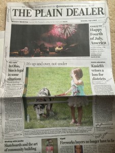
This mini assignment for my PR pubs class was to take a newspaper article and see how many styling elements in it.  We then had to circle and write what element it had.  This article was taken from the Cleveland Newspaper.  This article had most of the elements, but was missing pull quotes and subheading.

OU-Flag-Gaylord-Hall_large-179x300.jpg

Design Blitz!

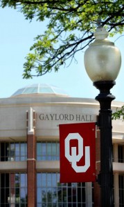
Symbol.   I chose this picture of the OU flag in front of Gaylord as an example of symbol, because when someone sees the OU logo they know it represents the University of Oklahoma. Typography. I chose this poster as an example of typography. It reads “education is the most powerful weapon” and the font … Continue reading Design Blitz! →

Typography

The three games I chose to play for this assignment were Shoot the Serif, Type Connection, and Poster Letters. My favorite was Shoot the Serif! Shoot the Serif: I enjoyed this game more than the others because it was an easy concept, yet the game itself was challenging. It got more intense as I was … Continue reading Typography →

Typography Games

For this assignment, I chose to play Shoot the Serif, Type Connection, and Kern Type. Shoot the Serif was much more difficult than I anticipated as the game went on. At first, it was very easy to pick out the serif font, but as the game progressed, that changed. It was interesting to see what all different types … Continue reading Typography Games

css.php