Wait, What?
My face when I realized there are 25 video tutorials for our next lesson: It has to be quantum physics and rocket science or Photoshop for Dummies.


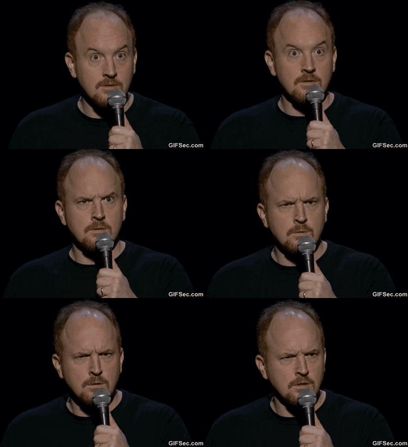
My face when I realized there are 25 video tutorials for our next lesson: It has to be quantum physics and rocket science or Photoshop for Dummies.
Shoot the serif- I found it easier to identify which letters were sans-serif. The bold letters were easier to recognize, while the serif letters weren’t as obvious. Type Connection- I didn’t really understand this game.. Type War- This game was extremely frustrating. I made it to level 8 (if you played it, you know this … Continue reading “Typography”
Hello Lovely Viewers! For this week we had to find design elements in random objects within our lives and this assignment was a little more difficult, but satisfying after completion. After going around my house and have difficulty finding an object I was content for Color, I stumbled upon my backpack that I unceremoniously dropped in … Continue reading Design? – Everywhere! →

Oregon (Balance) I took this photo two summers ago and it is a good display of balance. Some landscape photos are too sky or land heavy and are unbalanced in the overall photographic portrayal of nature. However, in this image there is balance between the sky and the landscape and neither dominates, but work cohesively … Continue reading “Design Blitz”
PR PUBS: Typography Games The games I chose to play were Shoot the Serif, Type Connection, and Typewar. By far the most fun was Shoot the Serif. It was very easy to pick up as well as get into. I got pretty good in my opinion and even forgot I was playing for an assignment. … Continue reading “PR PUBS: Typography Games”
In lesson 2 we were asked to develop listening and persuasion skills around Public Relations. We learned the difference between marketing, advertising and PR. There were different videos that we were asked to watch that pertained to these concepts. I enjoyed watching the videos because it gave me a different view on why these certain … Continue reading “Reflection 1-PR Writing”

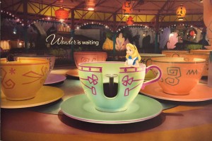
PR PUBS: Design Blitz Color, Symbols, use of space: The first piece I chose was a brochure that I received from Walt Disney World. Being a big Disney fan I was excited to be able to use this example. This is a picture of the cover of the brochure. This speaks to several of the … Continue reading “PR PUBS: Design Blitz”
Hello Lovely Viewers! Like many people, I never would have guessed there were games such as font games. However, the internet has almost everything these days from instructional videos on rocket science to typography games. For Pubs, my fellow classmates and I were required to play at least three Typography games. This is to hone our skillZ by … Continue reading Typography Games? →
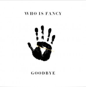
There are several design concepts; Color, typography, metaphors, minimalism, form, balance, rhythm, proportion, dominance and unity. These concepts, is applied correctly can be applied to create pieces that have a big and memorable impact. The use of metaphors or symbols is a great way to reach a viewer on a deeper level. If the viewer is … Continue reading Concepts of Design
