image1-3-1-225x300.jpg

Newspaper Markup

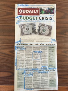
For Lesson 1.3 Bootcamp, I learned typesetting on InDesign. Professor Crooms’ video over the different elements of newspapers and newsletters for InDesign was super beneficial. I love watching these videos because I am way more of a visual learner, so they are very helpful. The basic design elements of a newspaper or newsletter include: masthead, … Continue reading “Newspaper Markup”

IMG_1902-300x200.jpg

Design Blitz

Yes, most of these photos are of myself. This was more of a convenience factor, I promise I am not this self-obsessed. A couple of friends and I recently had a “photo shoot” for our LinkedIn accounts and professional portfolios. When I was looking at the photos I realized they exemplified some of the design concepts … Continue reading Design Blitz

Screen-Shot-2016-02-01-at-3.25.48-PM-300x132.png

Typography

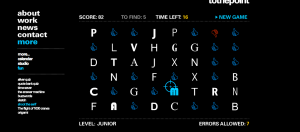
As a newbie online designer some of these game were actually challenging for me. It is easy to learn facts about design elements but actually having to sit down and decipher the differences between fonts was more difficult than I anticipated. Also who know they have front games for people to play. 1.Shoot the Serif  Okay … [Read more…]

Screen-Shot-2016-02-01-at-1.29.52-PM-300x142.png

Typography

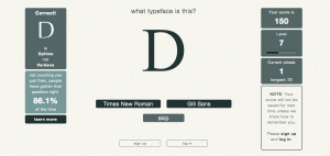
I was hooked on these typography games! Unfortunately I was on a time crunch so once I started playing Type war I could not stop. I played Type connection, Type war, and Post letters. These games were interesting and fun because I have never thought about remember different types of font but I will definitely … Continue reading Typography

IMG_0836-300x225.jpg

Design Blitz

For the “Design Blitz” Lesson 1.2, we covered the basic design principles of PR publications. Learning about different design elements was interesting because I never noticed why our everyday items look the way they do. The first thing I usually notice while looking at something is it if it pleasing to the eye before functionality. … Continue reading Design Blitz

Typography

I thought the shoot the serif game was fun. At first I was pretty bad at it but the more I played it the better I was at identifying the serif. I would say I do not know anything about typography so this game was helpful with identification with a time limit. I found Type […]

Screen-Shot-2016-01-28-at-1.12.29-PM-1024x663.png

Typography

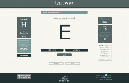
I am a competitive person so these typography games were right up my ally. I really enjoyed Kern Type and Type War. I was low-key obsessed with Type War though… When I found out extra credit was involved if you got to Level 10 I was hooked. We were given permission to cheat. So, I … Continue reading “Typography”

nfl.jpg

Design Blitz

Color- This business card stands out to me from other business cards I have received at networking functions because of its unique light blue color. This color is the companies main color and is also used with their website with fonts and other elements. I find this color to be a unique color to use […]

css.php