IMG_0379-e1421778487581-300x300.jpg

D E S I G N blitz

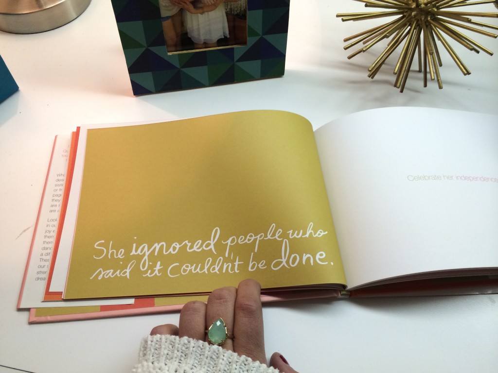
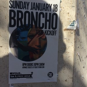
I was challenged with undertaking a “Design Blitz” where I utilized five different design concepts and found examples of each around OU’s campus. The concepts are illustrated through advertisements, flyers, sidewalk chalk etc. This assignment challenged me to take the literal meaning of various design concepts and apply them to the “real world”. The concepts I […]
Screen-Shot-2015-01-26-at-3.41.15-PM-300x230.png

Typography

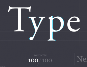
Kern Type: I’m a perfectionist, so while playing the game Kern Type, I was set on achieving a perfect score. I was surprised that it took me a couple of times to get the hang of it, but once I did I was pretty consistent in my scores. When I got a 100/100 I was finally … Continue reading Typography

IMG_5942-1024x768.jpg

Procrastination, Minimalism, and Use of Space

pro·cras·ti·na·tion prəˌkrastəˈnāSH(ə)n/ noun the action of delaying or postponing something.
 “your first tip is to avoid procrastination” So now that you know what procrastination is, let me put it into practical terms for you. Forgetting to take pictures for your design blitz assignment. I knew instantly that minimalism and the use of space is what […]

Screen-Shot-2015-01-26-at-10.02.02-AM-238x300.png

t y p o g r a p h y

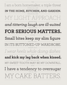
This might have been my favorite school assignment of all time. I don’t know a ton about typography but I would like to think I know what looks good. Since my high school design and copy layout editor days I haven’t gotten much of a chance to show off my creative side. Now this semester I […]

Screen-Shot-2015-01-25-at-9.30.02-PM-1024x793.png

Launching Matt Woods Creative

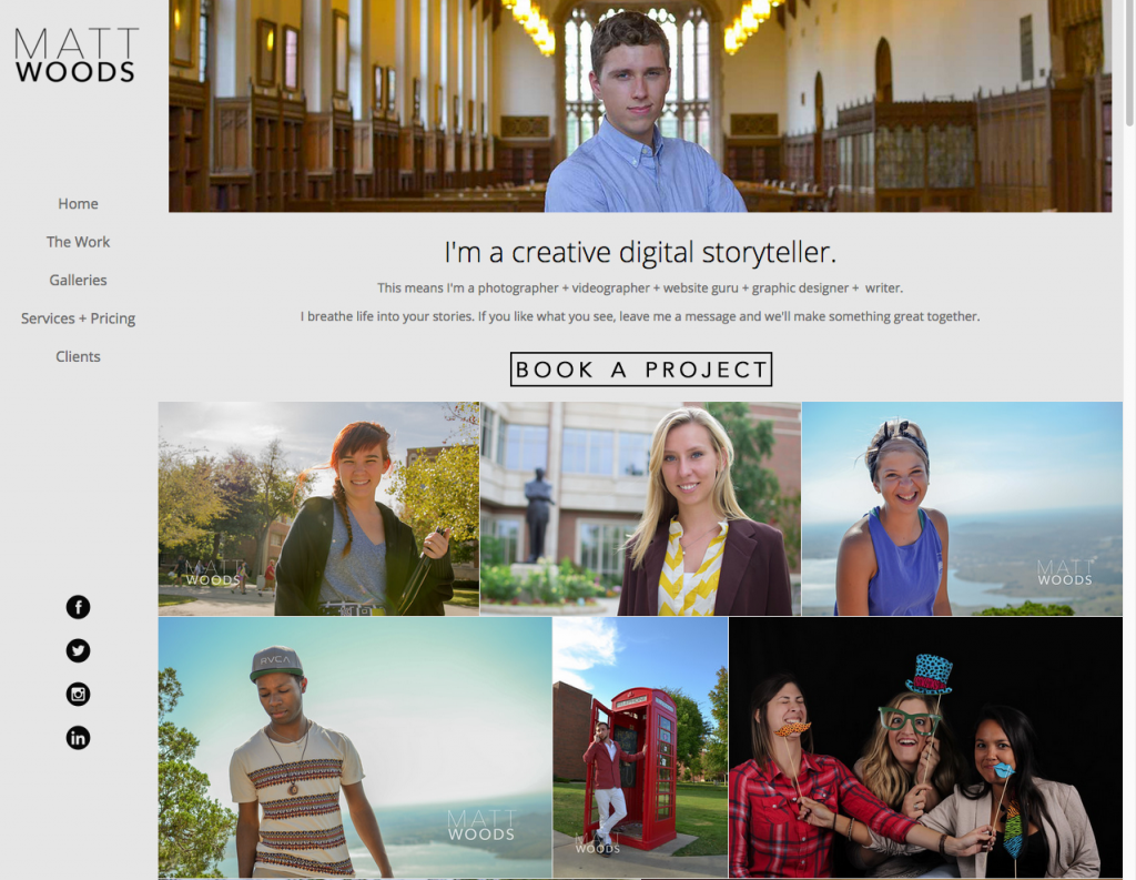
I recently launched an online portfolio and website marketing my freelance photo, video, design and website creation skills at mattwoodscreative.com Take a peek and if you or a friend could benefit from my services, I’d love for you to get in

screen-shot-2015-01-25-at-3-05-54-pm.png

Typography

Week two of my PR Publications course schooled me in the basics of graphic design. Our instructor emphasized the importance of Typography to the art of visual communication, and in an attempt to sharpen our eye for this design concept, we were assigned a series of Typography games. Shoot the Serif   Until this game, I […]

i-shot-the-serif-300x191.jpg

Proof that this girl is typographically challenged

At least I tried, right? I ended up playing all of the typography games, because why not? The only one I’m not showing proof of was the movie title game, because, in all honesty, my attempt at that one was truly an epic failure. Favorite Game goes to… Shoot the Serif.…

Screen-Shot-2015-01-23-at-10.13.49-AM-300x150.png

Typography Games

In the week two unit, I learned how important an element typography can be when constructing a message. As part of our weekly assignment, we were asking to play some online typography games. I tired all five games and will discuss my thoughts on each. Shoot the serif. This game made me nervous! The objective […]

unnamed-3-300x298.jpg

Design Blitz

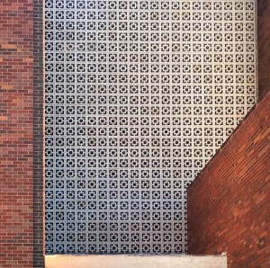
Rhythm, or the repetition of elements, can be used to establish pattern and texture. I think rhythm was used successfully in this example. The white tile pattern adds interest to an otherwise generic brick building. Color can be used in many ways. Neon colors (like those used in caution tape and traffic cones or markers) […]

Typography Games

I had the most fun playing “Poster Letters”. It always amazes me that our brain recognizes brands and titles just based off the colors and fonts used. I was surprised at how many answers I got correct. I think “Shoot the Serif” was one of the most beneficial games. It forced me to think quick … Continue reading Typography Games →

css.php