Screenshot-2015-01-28-11.15.52-300x89.png

Typography

Our second assignment over the week was to play online typography games, which helped train my brain to internalize different fonts in a creative way.   The first game I played was “type connection”, which meant I would choose a font and find it’s love interest after choosing what type of personality it had. For example, the above […]
Screen-Shot-2015-01-28-at-11.33.38-AM-300x270.png

DESIGN BLITZ

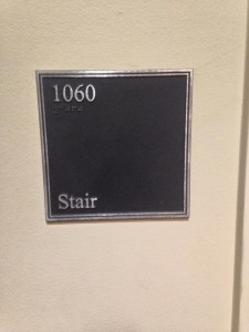
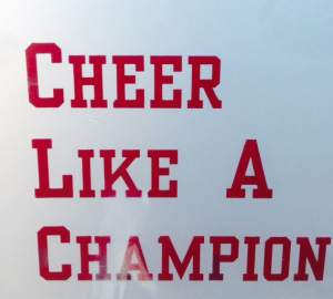
  TYPOGRAPHY Typography is the arrangement of type. Typography is an artistic component of design that arranges type into a visually pleasing and legible layout.  This is a sign near the football stadium and the clear, bold type draws fans’s attention to it.   COLOR This particular logo is bombarded with different aesthetically pleasing colors. […]

IMG_9144-225x300.jpg

Design Blitz

For this assignment, I was asked to go on a scavenger hunt in order to find print publications that illustrated effective design principles of visual communication.  The principles that were emphasized in class included the following: Color Typography Metaphors/symbols Minimalism & use of space Form/function/message Balance Rhythm Proportion Dominance Unity After meandering the halls of …

Screen-Shot-2015-01-19-at-5.14.52-PM-300x158.png

Test of Typography

In order to familiarize myself with the use of different type fonts, this assignment asked me to play three different typography games. As an enthusiast of aesthetics, I was excited to learn how different fonts can convey different messages and ideas through typography design. The first game that I played was called Type War. In …

10942741_10152976521241132_7449006050319578607_n-225x300.jpg

Eye Candy 101

            Over the past week, our class studied several design elements that can enhance the message a designer would want to send to an audience.  We focused on how to create simplicity, clarity and unclutteredness in a design. Our class was asked to take photos of different objects, advertisements or signs […]

Typography

The three games that I enjoyed playing the most were Poster Letters, Type War, and Shoot the Serif. I enjoyed the Poster Letters game the most because I enjoy watching movies. I thought that I would achieve greater success at the game than I did, but I still had fun. It made me think and […]

IMG_4092-e1422460584890-225x300.jpg

Campus beautiful by day and night

In this assignment, we spent the day walking around campus to take pictures of examples to represent different types of design concepts. I really enjoyed getting to spend they day outside; I don’t often take time to experience campus like I used to, so being reminded how beautiful The University of Oklahoma truly is was Continue reading

Screen-Shot-2015-01-28-at-9.23.32-AM-1024x640.png

Typography Games

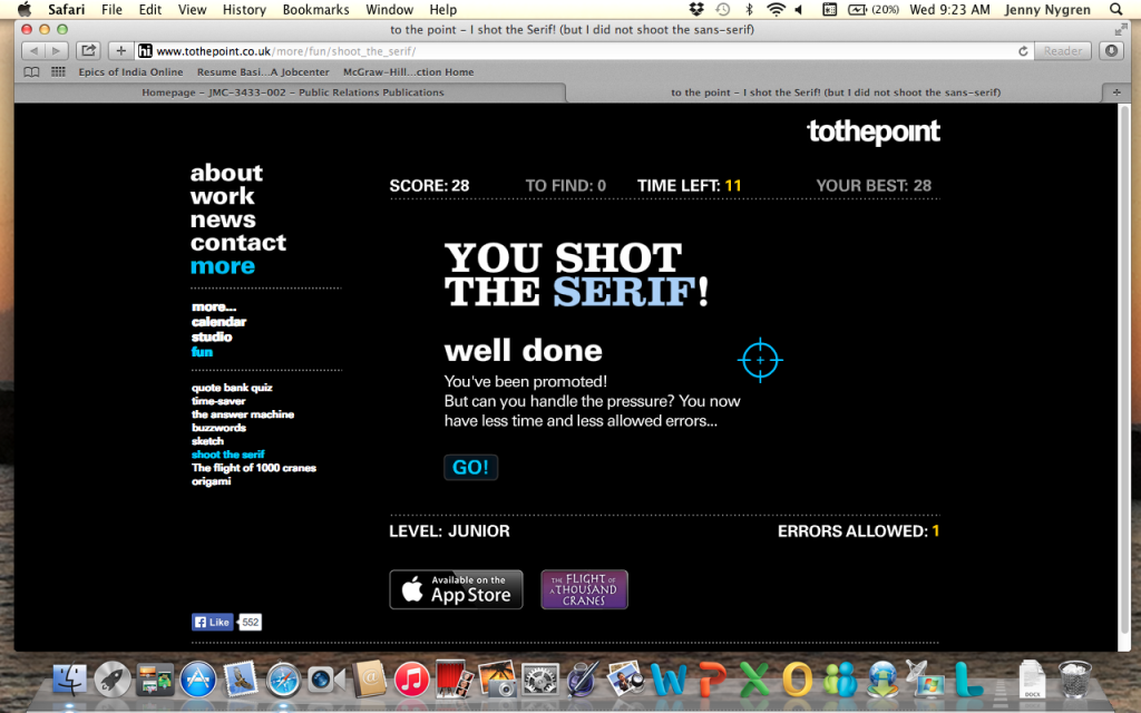
I shot the serif, but I also did shoot quite a lot of the deputies (sans-serif fonts).  In this game the two different font types are mixed in together and the user plays a first-person shooter style game to identify the serif fonts from the sans-serif fonts.  Practice makes perfect with this game, but it’s frustrating […]

IMG_4311-e1422456295564-768x1024.jpg

Design Blitz!

When learning about design elements, I realized how important the details are. The assignment I was given was to explore my own campus and find these elements in everyday life. First, I found minimalism. In print, minimalism is used to make sure the message is clear without distractions. In nature, I found this bare tree…

image-1024x768.jpg

Typeography

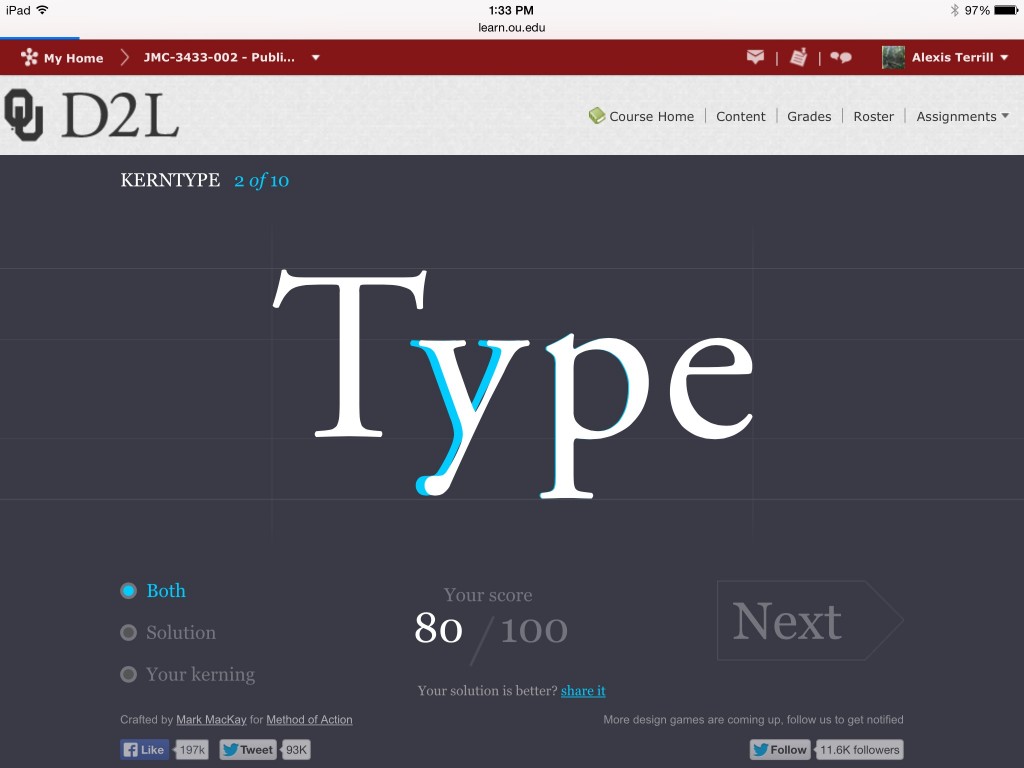
Recently in class we discussed the topic of typography. During my experience with typography, I realized I’m rather inadequate at font games. I doubt this will hinder my career much, but my pride was a little hurt. I started with the game “Kern Type” where I was unpleasantly surprised to find out that it is…

css.php