IMG_3149-225x300.jpg

Design Blitz

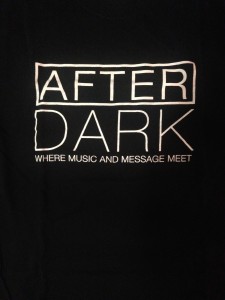
During my design blitz, I found this t-shirt promoting an event called AFTERDARK. I thought it was a great representation of dominance and contrast. The large, white writing on a black background dominates the t-shirt and really makes it stand out. It’s definitely effective in getting people’s attention. The OU flags displayed all over campus … Continue reading Design Blitz
IMG_7506-225x300.jpg

Media Blitz

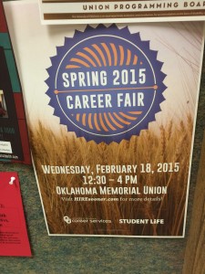
There are many elements that go into making a publication appealing and useful. These elements include the proper use of color, use of space, balance, rhythm, proportion, etc. You can learn a lot from just observing publications and seeing for yourself what works and what doesn’t. In this post I will explain and give examples…

Screen-shot-2015-01-28-at-3.46.22-AM-300x144.png

Typography

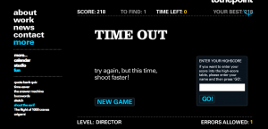
Shoot the Serif was my favorite game to play out of the five games that were listed. I tried all of them and this was definitely my favorite because I felt challenged to beat the time. I made it to level: Director. This game helped me to identify the differences between Serif vs. San Serif … Continue reading Typography

DSC_0302-300x201.jpg

Design Blitz

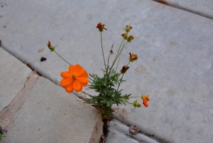
Design Concepts are everywhere. I enjoyed looking for the different concepts and capturing them in photographs. I now find myself critiquing certain advertisements and images. I am no expert but doing so, helped me to get a better understanding of these concepts. Here are a few images that I captured. Color: I love how this … Continue reading Design Blitz
Learning is fun when you’re playing games

In my publications class, we were required to play three out of five typography games that we were given. To be honest when we first got the assignment I wasn’t sure if it would be that enjoyable, but the majority of them were pretty decent! I’ll tell you about my three favorites. Poster Letters  This Continue reading

image5-e1421779044693-768x1024.jpeg

Design Blitz

It’s estimated that people see about 5,000 advertisements per day.  This number is a dramatic increase from the 1970s where people saw around 500 advertisements per day.  The assignment for today was to venture outside the classroom and take pictures of real life examples of design concepts.  A positive aspect about doing this assignment today […]

Typography

Round 1: The game I chose to play was called ‘shoot the serif,’ which was totally entertaining and funny. My first try, I hate to admit, was awful! But the more and more times I tried, the better I got. It started to get easier and easier to identify which letters were in the Serif … Continue reading Typography

10891766_10203675699798688_4801634006846214767_n-220x300.jpg

Color & Space

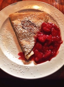
A friend and I decided to go to this really cool restaurant that happened to serve one of my favorite dishes… crepes! After learning about the many different design concepts in my Public Relations Publications class, I decided to take this photo to emphasize the use of color. It may not be a picture of … Continue reading Color & Space

Screen-Shot-2015-01-26-at-4.40.23-PM.png

Just My Type of Fun

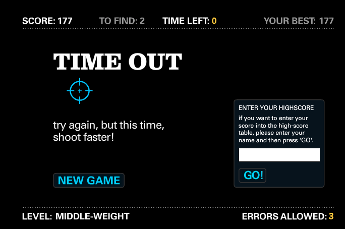
Shoot the Serif This game is obnoxiously fun, but your trigger finger gets a burn-worthy workout. I blasted through the Junior-level difficulty without any errors, but Middle-weight’s time limit felled me after 177 points. I recommend a zig-zag pattern to

FullSizeRender-655x1024.jpg

Design Blitz

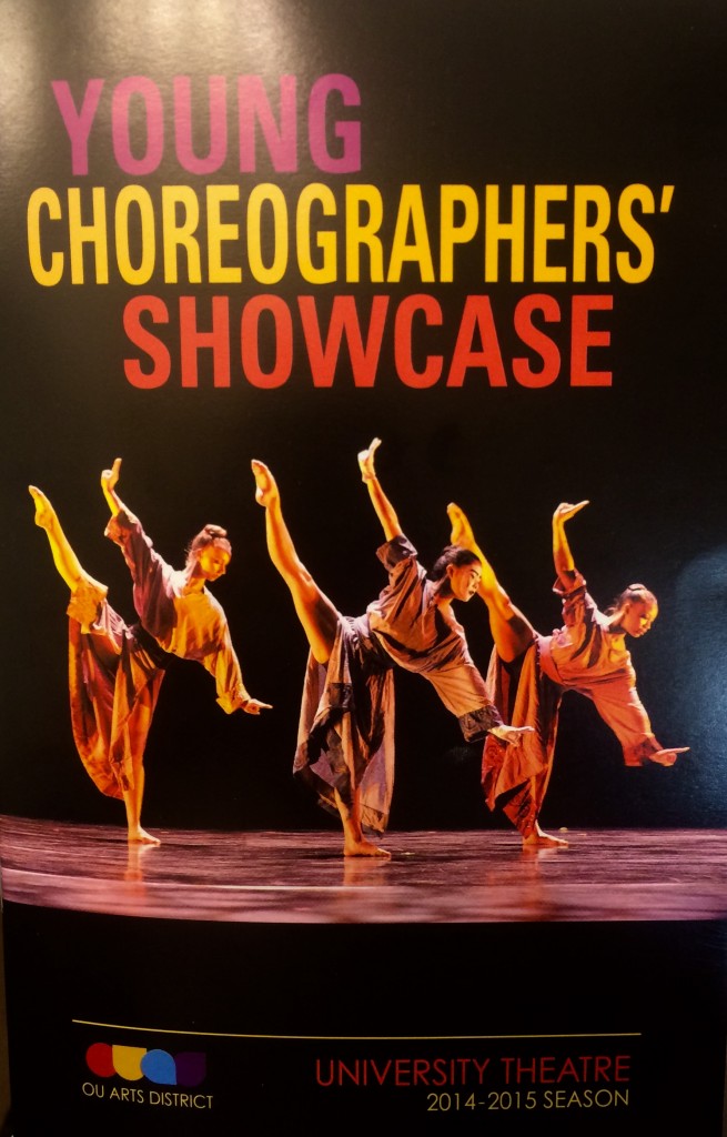
In addition to studying public relations here at OU, I am also majoring in ballet performance.  As a part of my ballet studies, I had the opportunity to perform in the 2015 Young Choreographers’ Showcase January 22 – 25.  As a result, I was able to see a variety of graphic design and publication material … Continue reading Design Blitz

css.php