Screen-Shot-2015-01-28-at-3.20.48-PM-300x202.png

Typography

After learning what typography is and finding out how critical it is in this week’s lesson, I was then encouraged to play three games relating to typography. The first game I played was Shoot the Serif. I started out at the junior level since I did not know what to expect for this game. I’ve […]

Screenshot-2015-01-28-11.15.52-300x89.png

Typography

Our second assignment over the week was to play online typography games, which helped train my brain to internalize different fonts in a creative way.   The first game I played was “type connection”, which meant I would choose a font and find it’s love interest after choosing what type of personality it had. For example, the above […]

Screen-Shot-2015-01-19-at-5.14.52-PM-300x158.png

Test of Typography

In order to familiarize myself with the use of different type fonts, this assignment asked me to play three different typography games. As an enthusiast of aesthetics, I was excited to learn how different fonts can convey different messages and ideas through typography design. The first game that I played was called Type War. In …

Typography

The three games that I enjoyed playing the most were Poster Letters, Type War, and Shoot the Serif. I enjoyed the Poster Letters game the most because I enjoy watching movies. I thought that I would achieve greater success at the game than I did, but I still had fun. It made me think and […]

Screen-Shot-2015-01-28-at-9.23.32-AM-1024x640.png

Typography Games

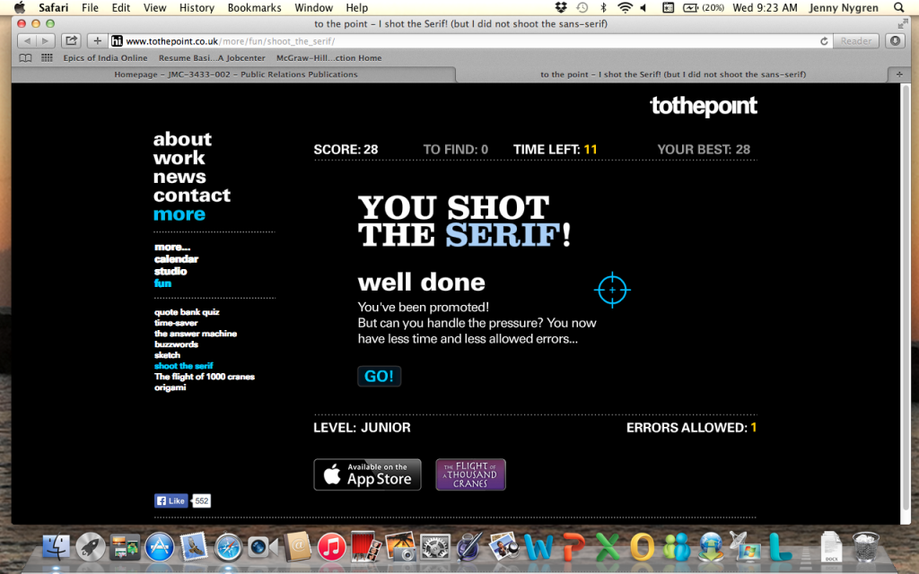
I shot the serif, but I also did shoot quite a lot of the deputies (sans-serif fonts).  In this game the two different font types are mixed in together and the user plays a first-person shooter style game to identify the serif fonts from the sans-serif fonts.  Practice makes perfect with this game, but it’s frustrating […]

image-1024x768.jpg

Typeography

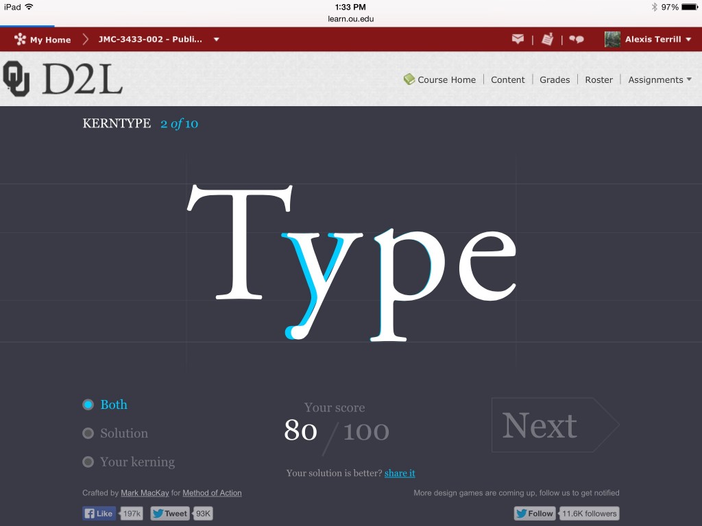
Recently in class we discussed the topic of typography. During my experience with typography, I realized I’m rather inadequate at font games. I doubt this will hinder my career much, but my pride was a little hurt. I started with the game “Kern Type” where I was unpleasantly surprised to find out that it is…

Screen-shot-2015-01-28-at-3.46.22-AM-300x144.png

Typography

Shoot the Serif was my favorite game to play out of the five games that were listed. I tried all of them and this was definitely my favorite because I felt challenged to beat the time. I made it to level: Director. This game helped me to identify the differences between Serif vs. San Serif … Continue reading Typography

Learning is fun when you’re playing games

In my publications class, we were required to play three out of five typography games that we were given. To be honest when we first got the assignment I wasn’t sure if it would be that enjoyable, but the majority of them were pretty decent! I’ll tell you about my three favorites. Poster Letters  This Continue reading

Typography

Round 1: The game I chose to play was called ‘shoot the serif,’ which was totally entertaining and funny. My first try, I hate to admit, was awful! But the more and more times I tried, the better I got. It started to get easier and easier to identify which letters were in the Serif … Continue reading Typography

Screen-Shot-2015-01-26-at-4.40.23-PM.png

Just My Type of Fun

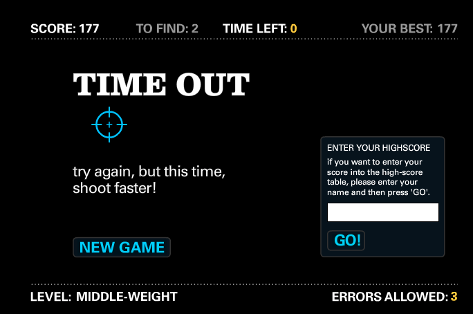
Shoot the Serif This game is obnoxiously fun, but your trigger finger gets a burn-worthy workout. I blasted through the Junior-level difficulty without any errors, but Middle-weight’s time limit felled me after 177 points. I recommend a zig-zag pattern to

css.php