IMG_1936-300x200.jpg

Design Blitz

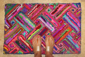
Color: The Colors on this rug are so bright that they are almost distracting, but with the design aspect in mind, it is able to tie together any colors that might be used in other areas or objects.  I am a fan of this use of color, but it must be used wisely depending on what else … Continue reading Design Blitz

Screen-Shot-2015-09-02-at-4.38.09-PM-300x184.png

Typography

I have always thought typography was important to design. I even went so far as to download several different fonts onto my parents computer when I was in middle school because I liked the idea of making a boring paper or assignment unique and nice to look at. We were asked to play a series of … Continue reading Typography

IMG_7056-225x300.jpg

Design Blitz

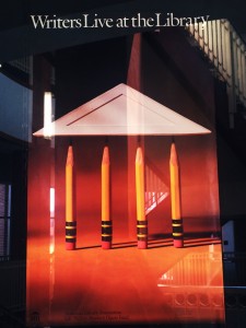
This week in PR Publications we have been learning about the importance of design and typography. The assignment was to look at the world around us and take pictures of the use of different elements of design in our every day life.   ‘Balance On this poster that says “Writers Live at the Library,” four…

Screen-Shot-2015-08-30-at-3.42.55-PM-300x195.png

Typography

Over the past few years, I have repeatedly learned that how something is displayed will determine the type of message it gives to others. However, I didn’t realize how much effect the type of font can have in creating an attitude for a publication. Typography is not something we are usually taught in our classes, but I think it is very important for anyone who will work in a creative field of work. In my PR Publications class this semester, we were asked to play a few games to help sharpen our typography skills. I thought they would be a breeze, but they were actually harder than I originally thought. Below are my thoughts that I had while playing this fun learning games. Shoot the Serif In this fun game, the Read More …

IMG_2288-e1441223013807-225x300.jpg

Design Blitz

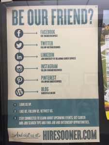
As a public relations student, I have come to realize that the way a message is structured can determine how effective it is. Now as I learn about design techniques, I have discovered that the way a publication is created will also cause how the viewer perceives it. There are many different principles that can affect the end result, but here are five that I have found in every day things. Repetition The design concept of repetition strengthens the message being given by creating a pleasing visual image to the viewer. The repetitive flow of information easily informs the reader of what is being said. This poster is a good example of how repetition can look in an every day setting, for it is listing the social media sites for OU Read More …

Screen-Shot-2015-09-01-at-12.42.02-PM-300x191.png

Typography

Typography has always been something that is aesthetically pleasing to me. I love when a magazine or poster just picks the perfect font for the point they’re trying to get across without being too obvious about it. With that being said, however, I have never really taken the time to study fonts or the design … Continue reading Typography

Typography

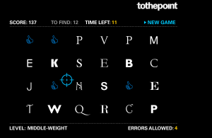
Shoot the Serif When first deciding which typography game to play, shoot the serif seemed like a silly game. How hard could it be to find the serif fonts versus sans serif fonts? I attempted it anyways, thinking it would be easy enough. But after passing quickly through several levels, it got much more difficult.…

1911726_10152001232207799_910656714_n-252x300.jpg

Design Blitz

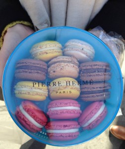
Through my time in Barcelona, Spain, I got to travel to many cities in Europe. During the experience, I saw many different types of advertising and public relations. The examples focus on different elements of concepts learned in this lesson. Some of the best examples are explained below. To begin, Pierre Hermé is a macaroon … Continue reading Design Blitz

Screen-Shot-2015-09-02-at-12.47.29-PM-300x194.png

Typography

As a public relations student, I have always been aware of fonts but have never taken the time to know them. Through a few games, I got to know a handful of the fonts very well. I played Type War, Shoot the Serif and Kern Type. Type War was full of frustrations as I was … Continue reading Typography

29acd58aedb6ef6643e06782dbdb0a02.png

Typography

  These games had me like…  Shoot the Serif This was by far my favorite game! it was fun and was really helpful when identifying serif fonts. Especially as one got farther in the game, seeing multiple texts side to side helped me get accustomed to what a serif font was. Poster Letters This was … Continue reading Typography

css.php