Screen-Shot-2015-01-27-at-5.27.50-PM-300x261.png

Typography

7/46= My score to the poster letters game. Before this game, I always thought I was kinda decent at recognizing logos or brands by just glancing at a small piece of it. Boy, was I wrong. This game was really fun and showed me how fonts can really help “jazz up” a movie.   Come […]

FullSizeRender-4-214x300.jpg

“dEsIgN bLiTz”

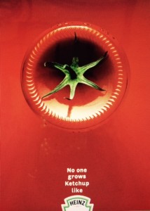
For this particular assignment, I chose to mainly focus on advertisements to relate to a few of the terms we learned about in this unit. Please excuse my photography skills on some of the images. I am horrible at cropping/editing, hence one of the reasons why I need so much help with Photoshop and InDesign. […]

IMG_6950-e1422398519462-225x300.jpg

Design Blitz

For the purposes of a class assignment, I was asked to observe design elements in my everyday life. Design is everywhere and it was not hard to pick out these elements once I knew what I was looking for. I tried to look for works of all kinds: good, bad, mediocre, and all. Below, I … Continue reading Design Blitz

IMG_6889-225x300.jpg

Design Blitz

This week for my PR publications class we were asked to go out across campus and find different ads, signs and objects that described different elements of design. For me, this was a fun opportunity to search for things around campus that displayed certain design elements. The five design elements that I found were symbols, […]

photo-5.jpg

Design Blitz

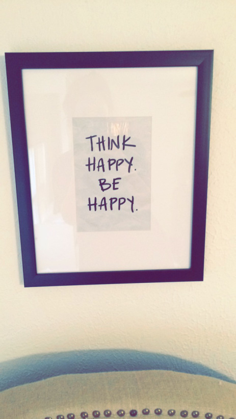
As I continue with the second week of my PR Publications course, I am starting to gain a deeper understanding of various design concepts. Our instructor gave us the chance to apply this understanding by finding examples of these designs, taking pictures and identifying which concept they represent. MINIMALISM & USE OF SPACE   I love […]

IMG_43141-271x300.jpg

Design Blitz

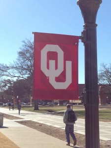
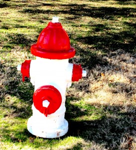
For this Design Blitz Alexis Terrill, aka @drpancake, and I took a stroll through OU’s campus in search of objects that fit five of the Design Blitz categories. The five I chose were color, symbol, typography, balance, and minimalism. Color I chose this fire hydrant as my example of color, due to the contrast of […]

IMG_0982-225x300.jpg

Design Blitz

These 5 design concepts were interesting to learn about because I honestly haven’t put much thought into them until this unit. I was sitting at home thinking about what pictures I would find and honestly thought it might be tough. I decided to go on a walk and I immediately found things that matched each […]

Screen-Shot-2015-01-27-at-1.56.00-PM-1024x351.png

Word Games

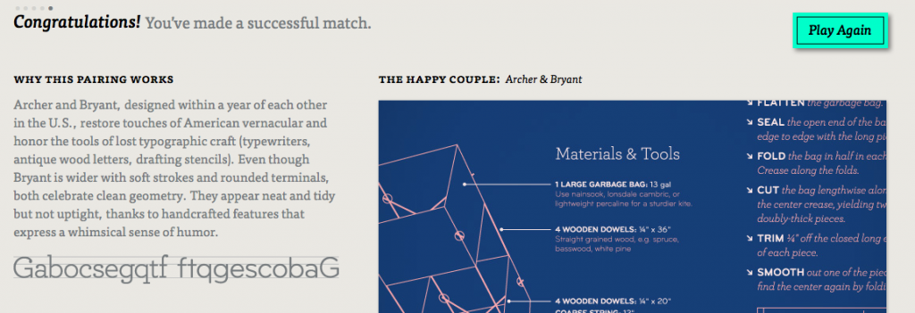
I’d just like to start out by saying that I successfully guessed 15 letters in Poster Letters. So I’d say I have the lead at this point. But man, was I bad at pairing fonts in Type Connection! I tried to match Archer, and obviously they gave me three different options that he might go […]

Screen-Shot-2015-01-26-at-10.54.30-PM-1024x676.png

Typography

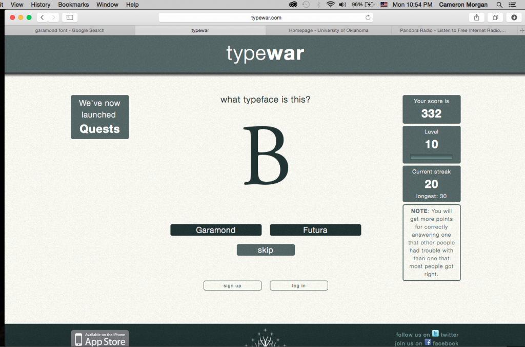
Let me begin this post with a disclaimer: I am an EXTREMELY competitive person.  Any time I play a game, I play to win!  And so, as part of this semester’s journey into Public Relations Publications, it was time to examine some type and fonts. What better way to learn than to play! With that … Continue reading Typography

css.php